Influential titles in graphic design
The Elements of Typographic Style
by Robert Bringhurst
Vancouver: Hartley & Marks, 2015
$40 / 9780881792126
The Solid Form of Language
by Robert Bringhurst
Kentville, NS: Gaspereau Press, 2004
$19.95 / 9781894031882
Reviewed by Thomas Girard
*

“The Bible of Typography” is how this book was introduced to me and referred to again and again during my undergraduate studies in communication design in Vancouver, Canada. From the time I pulled the spine off the shelf to the first moments I leafed through it, to the reads and rereads, to my referencing and discussing it, quite honestly it simply feels that way. Often uncompromisingly poetic yet so right that you can’t ignore it, Bringhurst’s The Elements of Typographic Style has been required reading for anyone studying in the field since the conception of the term communication design.
Often drawing from patterns in nature and math, the reader will, in part, be introduced to universal aesthetic principles, like page sizes, type sizes, and line spacing based on numbers in the golden section, strings in the Fibonacci sequence, or other timeless rules. To emphasize this point, Bringhurst doesn’t so much use obvious and overt copy-and-paste examples as much as employ timeless principles.

The accompanying illustrations are as carefully crafted as the words themselves. Not just decorative, they work to explain and embrace the content for not only an educating reading experience, but a memorable one as well.
As a piece of writing to be used for applied graphic design, one might falter in applying Bringhurst’s ideas. The concepts can be difficult to grasp and abstract in the way that they don’t clearly allow for problem solving or opportunity finding for its believers. Still, it isn’t short of believers and any sort of backlash against the text can be staunchly defended, simply because the concepts are just that good. In tangential design specialties, for example interaction design, one might prefer designer Bill Moggridge (one of the founders of design company IDEO) as a primary text and shy away from such a typographic focus. But I would argue that typography is the hallmark of design and broadly speaking, can be made a focus and almost an ideology of any design education.
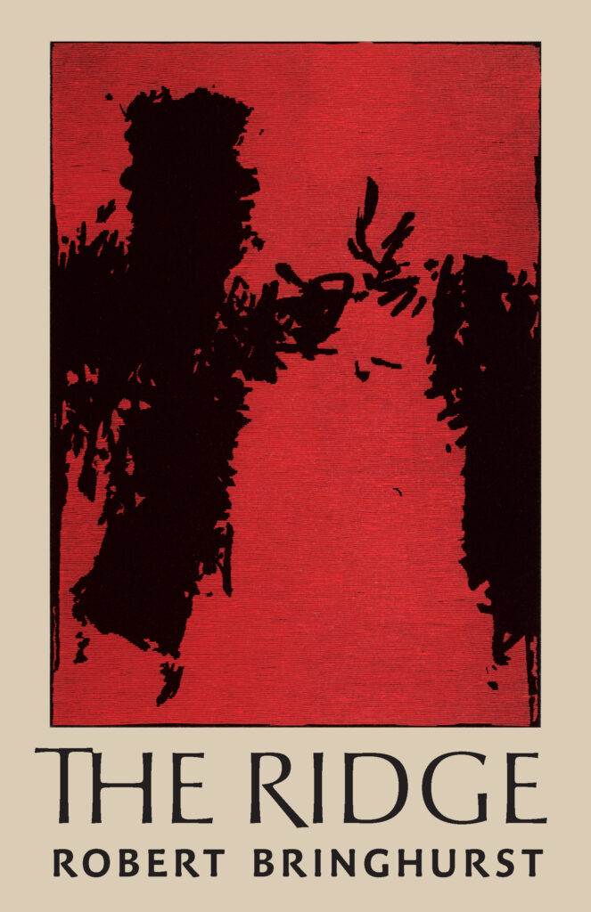
At the time of this writing, Robert Bringhurst, who became an Officer of the Order of Canada in 2013 for “his contributions to Canadian literature and to the preservation of First Nations’ culture, as a poet and cultural historian,” has tasks associated with folklore in the field, such as converting primarily spoken languages in written form on his home on Quadra Island. He writes broadly and has published books you may not even realize are his, they are so varied and established in their own scholarly contexts.
This book in particular in its black paperback edition, is instantly recognizable and fits in the hand in an almost ergonomic, muscle memory fashion. The pages have a crispness and texture that all good books should have. The lengths at which Bringhurst goes to explain, again through an almost poetic modality, this sometimes obscure and let’s say geeky field, are notable, in terms of their pure, ambitious depth. One might go through a first reading perfectly impressed yet totally confused, ready to jump right back in at the beginning again.

The professor that I personally associate with the book and my education through it often referred to other books that approach graphic design in the same way, such as The Timeless Way of Building by Christopher Alexander or Beautiful Evidence by Edward Tufte. As a young student, I only had enough money in envelopes around Christmas time to buy two or three books, and this was among them. All these books emphasize that capital D-design can exist through not just the careful hand of a knowledgeable human, but a kind of natural maturity through its use and evolution as a part of the built environment, or in the journey of an object of design and its use, as is good worn leather, or in the nuance of an experience that emphasizes a path less taken when a carefully engineered sidewalk seemed like the obvious solution.
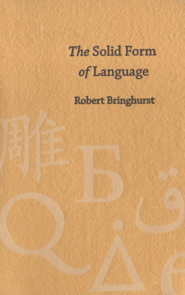
Bringhurst’s The Solid Form of Language, was not so much a suggestion from another as my own manifestation. Possessing a seductive, textured cover and slim, small design, embossed with type on the cover and reaching a kind of unattainable aesthetic, it too aims to talk about complex topics, more along the lines of the content of typography than typography itself.
I’m writing this in part to address the request from readers of my other typography texts to write about Bringhurst, or perhaps pursue a retrospective. Both of these requests are solid and probably long overdue, so in this I attempt to take a first look at this pursuit.

Other articles I’ve written for The British Columbia Review including and mentioning design luminaries like April Greiman, Erik Spiekermann, Jessica Hische, Marian Bantjes, Ellen Lupton, and Alex Trochut are arguably better representations of an overall typographic discourse, but there is clearly interest around Bringhurst these days, so I would say his text can be timely and important. As a lens on local successes in B.C., Bringhurst can never fall short.
Both of these books intend to be in your hands as well as in your heart, and that is where they belong. Enjoy them, as I did – as I do.
*

Thomas Girard (born 30 December, 1980 in Vancouver) is a Canadian scholar. Girard was accepted to attend the University of Oxford in lectures equivalent to graduate coursework. Girard has received several Emerging Scholar awards, first at the Design Principles and Practices conference in Barcelona at the prestigious ELISAVA. At Emily Carr University of Art and Design he received his second Emerging Scholar award. Other awards include RBC Emerging Scholar, Royal Bank of Canada Foundation. In 2021, he was awarded Emerging Scholar from the New Directions in the Humanities conference in Madrid. He is a 2022 graduate of the Graduate Liberal Studies programme at Simon Fraser University. He presented “Advanced Typography Workshops in Quarantine” at the Sorbonne in June 2023. [Editor’s note: Thomas Girard has written several essays for The British Columbia Review, including a series on the subject of typography, User experience & Sophocles, Teaching typography in quarantine, and Podiums, prototypes, and Plato. He has also reviewed books by Marian Bantjes, Garnet Hertz, and Ron Wakkary for The British Columbia Review.]
*
The British Columbia Review
Interim Editors, 2023-25: Trevor Marc Hughes (non-fiction), Brett Josef Grubisic (fiction)
Publisher: Richard Mackie
Formerly The Ormsby Review, The British Columbia Review is an on-line book review and journal service for BC writers and readers. The Advisory Board now consists of Jean Barman, Wade Davis, Robin Fisher, Barry Gough, Hugh Johnston, Kathy Mezei, Patricia Roy, Maria Tippett, and Graeme Wynn. Provincial Government Patron (since September 2018): Creative BC. Honorary Patron: Yosef Wosk. Scholarly Patron: SFU Graduate Liberal Studies. The British Columbia Review was founded in 2016 by Richard Mackie and Alan Twigg.
“Only connect.” – E.M. Forster















3 comments on “Influential titles in graphic design”
This is an excellent and thoughtful article. Robert Bringhurst was instrumental in building an wide interest in typography in the early ’80s when he taught a masterful course at SFU called “The Book and its form:An Historical Anatomy of Literate culture.” He was designing books for D&M among other pursuits. with the founding of a new Lwtterpress studio in the SFU Library, and the fact that Special Collections holds important collections featuring typography and book design, it could be an auspicious time to embark on a project.
Thank you! Great thoughts! Bringhurst continues to resonate.