Where we enter
Essay: Where we enter
by Thomas Girard
[Editor’s Note: This is the third instalment in a series of essays on the subject of typography. You can read Essay 1 here, and Essay 2 here]
*

Typography doesn’t have one specific entry point anymore: it has many. If you’re ready to up your game, let’s look at a few here. Excuse the complexity of typographic language used here: typography is both an art and a science which makes complexity where it doesn’t necessarily need to be. That’s one of the dangers that we can puddle jump over, though. Typography and its people are the most normal part of this philosophical balloon, which is why we talk about it and them.
The names that find their way into these column entries are by no means exhaustive. Typography can be a place to enjoy for a lifetime, and many do spend their lives in this way. Today, typography can be approached in many different ways whereas at many times in history there was simply a single story and single entry point. Choosing whichever suits you or exploring many and then choosing are perfectly acceptable by most standards if you’re ready to know more about typography, or fonts. I say fonts with the word “fonts” in jest because in many ways that’s all we are talking about, and talking about it at length is, well, fun for some. Enjoy!
Bringhurst
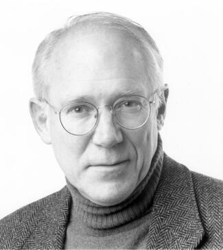
If you enter the world of typography from Western Canada like I did, among many other places that might have been, Robert Bringhurst would have been your entry point with his book The Elements of Typographic Style and perhaps also The Solid Form of Language. Bringhurst is framed as a poet, typographer, and author and I have fond memories of pulling his typography book off the shelf and feeling that I had pulled down a bible of sorts. In these books he goes into a kind of poetic complexity about the magic of type, which weaves itself into the form of his books, the paper choice, the elegant typographic illustrations on the cover, the infographics inside, the mathematical almost Tufte-esque charts, etc. Based on Quadra Island, my most recent news about him was that he was spending time turning oral languages into visual languages that previously only existed orally. Robert Bringhurst holds the Order of Canada.
[Editor’s note: You can find Harold Rhenisch’s review of Robert Bringhurst’s The Ridge here]
Spiekermann
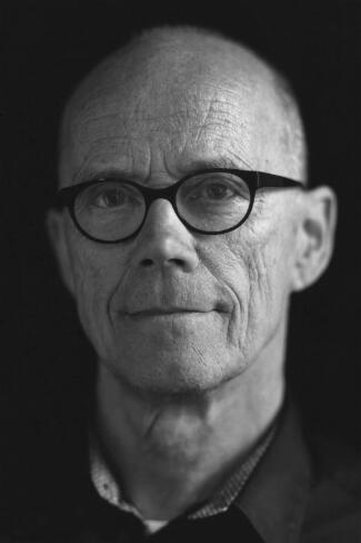
Erik Spiekermann is a Berlin-based German type designer, who spends time in the Bay Area, and is most known for his bestselling book Stop Stealing Sheep & Find Out How Type Works and his work on the font FF Meta. I recently interviewed him on my podcast Uniqueways and we spoke at length about his ability to tackle the most complex typographic problems, such as wayfinding and identity for an entire city or a city public transport wayfinding system. His outgoing personality combined with his no-nonsense ideas about rudimentary typography to make him an obvious choice to learn from early on. He coined a concept about how not to do letter spacing: “stealing sheep,” a typographic technique for typesetting strings of text. This became part of his identity (or what you might call personal branding these days) and today’s young graphic designers learnt about this growing up. He now runs a printing press revival studio in Berlin and invites guests in for typographic workshops.
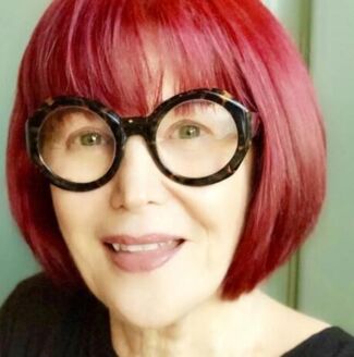
Lupton
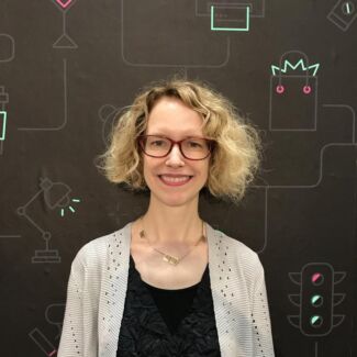
Ellen Lupton is an American contributor, not only in books but also in teaching. Lupton presents typography as well as things like grids in no-nonsense rhetoric. She makes it fun and not as typographic. Holding a long-standing Chair appointment at MICA (Maryland Institute College of Art) in Maryland, Lupton frequently publishes on the platform Skillshare, where she was an early contributor there. She is also currently focusing on Instagram Reels. If you aren’t mixed in to the American vernacular you will still certainly come across her books in your early typographic education. Her hair and clothing style also compliment the ideas she is trying to convey: typographic ease and basics.
Weingart
If you were entering typography twenty or more years ago you certainly would have been aware of movements like postmodernism. Wolfgang Weingart was an active graphic designer during this movement. Graphic designers trying to make a difference in this movement published tomes: picture and concept books simply named “Typography” or something similar. I saw Weingart give a talk once as a teenager here in Vancouver and was taken by his straightforward approach to teaching typography. Those were the days before PowerPoint and he moved his typography on an analog projector in a way that made everyone in the packed auditorium shiver. Weingart made typographic simplicity a trend, if not a bit of an impossibility. Weingart’s unmistakable orange and yellow Typography book cover, and the sheer weight of his tome, gave him a visual authority that was unforgettable and of that period. Strongly attached to postmodernism, Weingart had a certain attitude and expression that was synonymous with typographic auteurs of that time.
Carter
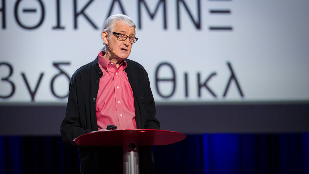
Carter presented at TEDTalks in Vancouver in 2014.
If the early internet was your entry point into typography, with mid ‘90s faces like Verdana and Georgia, Matthew Carter might have been your start. Known for his work on Microsoft Typography, his work on the Yale typeface, and his short appearance in the Helvetica film, Carter can be noted for having made letters in every way imaginable, starting with carving it out of lead for printing press type. On screen, Verdana, a “web font” that was a wide character sans serif and one of four fonts you could use on the web at one time, along with the serif Georgia, also one of those four fonts, would have been in your visual memory even if type wasn’t your thing. Particularly in the typographic world, Carter has recorded the highest order of accomplishment, and is unforgettable in many ways.
Gill
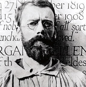
Mainly known for his work on the British typeface Gill Sans, and his controversial personal life, Eric Gill probably could be an entry point of sorts. He has a rather small book widely published on the topic, and it would be unfair to exclude that if you are anywhere in the UK you will see his type everywhere. Bringing humanism and eccentricity of type into mainstream usage could perhaps be one of his notable accomplishments. Some characters of Gill Sans are noticed even from afar and if you are immediately attracted to that I would offer him as a starting point to this wacky world.
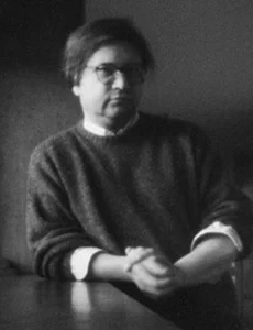
Tam
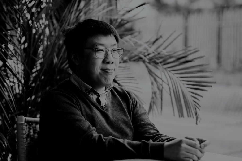
Keith Tam taught me typography at Emily Carr Institute of Art and Design here in Vancouver in the early 2000s. This was after graduating from the school as valedictorian and doing his masters in type design at University of Reading, a kind of typographic shrine masquerading as a department at a school. Tam spent time in the typographic world, at conferences and among typographic elite, shifting from place to place to teach typography, including professor appointments at Reading in the United Kingdom and Hong Kong Polytechnic. He currently runs the show at Hong Kong Design Institute in Hong Kong and has pioneered many of their offerings. I would be short-changing you not to mention his design of the typeface Arrival which is used almost exclusively on the wayfinding and signage systems at the University of Reading.
Greiman
April Greiman, noted in her Wikipedia entry as one of the first to use the computer to make art, was someone you might learn about through design history textbooks or Googling “notable typographers.” Her unmistakable visual styles give her a place in the canon that cannot be surpassed. On the one hand in the realm of the Wolfgang Weingart but on the other hand a Zuzanna Licko, or perhaps Susan Kare, Greiman’s work was and, at the same time, wasn’t typography.
Tufte
Mostly known for his work at Yale and set of illustrative books including Envisioning Information and Beautiful Evidence, it is perhaps feasible that Edward Tufte is your first entry into typography, if you look at it in terms of symbols and icons and the visual language of an academic. Considered more of a stats guy, Tufte runs a very well-respected set of workshops that aren’t typography but might be tugging at the heels of typography. It is strange that typography doesn’t make it into academic vernacular where other things do, and this might be an instance of that happening. Many may argue that this doesn’t belong here, but I’ll include it for the purpose of adding a unique angle.
*
In my next piece I’ll go into the future: the future and typography. It’s a divergent shift away from the design history modality that I’ve been primarily writing in here. Through interviews and personal conversations you’ll be happy to know that speaking with these individuals has unfurled what we all wonder about these days: what does your future look like?
*
Thomas Girard (born 30 December, 1980 in Vancouver) is a Canadian scholar. Girard was accepted to attend the University of Oxford in lectures equivalent to graduate coursework. Girard has received several Emerging Scholar awards, first at the Design Principles and Practices conference in Barcelona at the prestigious ELISAVA. At Emily Carr University of Art and Design he received his second Emerging Scholar award. Other awards include RBC Emerging Scholar, Royal Bank of Canada Foundation. For 2021, he has been awarded an Emerging Scholar award from the New Directions in the Humanities conference in Madrid. He is a 2022 graduate of the Graduate Liberal Studies programme at Simon Fraser University. He presented “Advanced Typography Workshops in Quarantine” at the Sorbonne in June 2023. [Editor’s note: Thomas Girard has written several essays for The BC Review, including User experience & Sophocles, Teaching typography in quarantine (also to be presented here) and Podiums, prototypes, and Plato. He has also reviewed books by Garnet Hertz and Ron Wakkary.]
*
The British Columbia Review
Interim Editors, 2023-24: Trevor Marc Hughes (non-fiction), Brett Josef Grubisic (fiction)
Publisher: Richard Mackie
Formerly The Ormsby Review, The British Columbia Review is an on-line book review and journal service for BC writers and readers. The Advisory Board now consists of Jean Barman, Wade Davis, Robin Fisher, Barry Gough, Hugh Johnston, Kathy Mezei, Patricia Roy, Maria Tippett, and Graeme Wynn. Provincial Government Patron (since September 2018): Creative BC. Honorary Patron: Yosef Wosk. Scholarly Patron: SFU Graduate Liberal Studies. The British Columbia Review was founded in 2016 by Richard Mackie and Alan Twigg.
“Only connect.” – E.M. Forster
One comment on “Where we enter”