Leading the typographic ornamentation movement
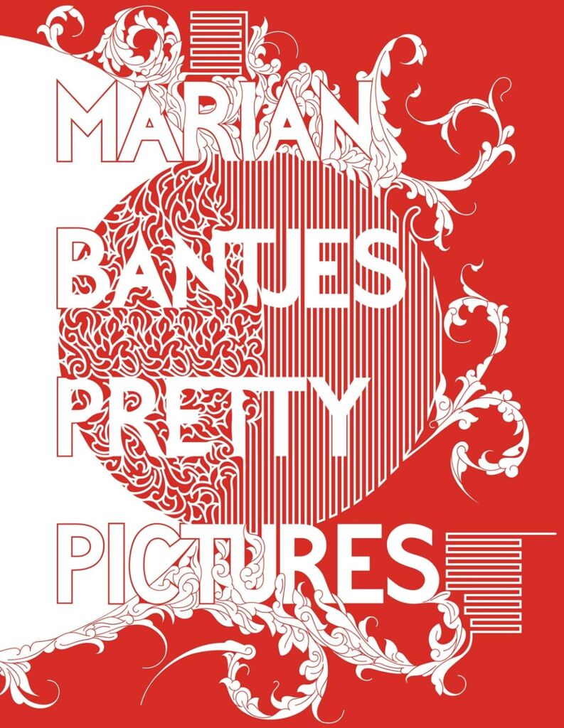
Pretty Pictures
by Marian Bantjes
New York: Metropolis Books, 2013
$99.00 / 9781938922220
Reviewed by Thomas Girard
*
I know of Marian Bantjes through folklore growing up studying design. The story goes that she was a print production craftsperson / typesetter / grunt work employee until one day later in life she started hanging out on an Internet forum, in the ‘90s, trying to break into the design elite, and through that channel became looped in with the names of the day, and specifically Stefan Sagmeister, who eventually started handing her spillover work from agencies. She resides on a small island near Vancouver. But it’s through Pretty Pictures that we see that there was more to her story in her remote location, in terms of the skill and craft of a designer that obviously had gifts beyond an ability to network or luck into her status.
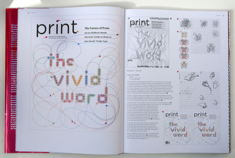
The first thing you’ll notice is the sheer heft of this book. Like books by designers in the ‘60s and ‘70s, this thing is massive, and beautiful. Instantaneously you’ll know where your money went. It’s a big book. The contents are quite simply page after page of beautiful intricate ornamentation – typographic niceties that make you think it’s AI generated, only to later realize this work precedes modern AI. The writing is typeset creatively, with ping pong paragraphs flexing in and out of columns and column wraps. You might not read it, but you’ll definitely notice it, and surely remember it. Flipping through in Pinterest fashion appears to be encouraged, and as you do it images might be conjured of black turtleneck minimalism architecture graphic design studio creatives working on the next big thing. You might step away only to return minutes or hours later for another dose.

Few people have done work in this realm simply because it’s so time consuming and difficult to master, I imagine. The names of the typographic world can be associated with movements: April Greiman with postmodernism, Jessica Hische with lettering, Matthew Carter with typeface design, and for the most part they go unchallenged. I would say Bantjes through this book does that with typographic ornamentation. There is no one who is her equal in this respect.
One notable aspect of Bantjes typographic compositions is that they all resemble the poster. The poster is a hallmark of typography and perhaps one deliverable that will never disappear. But in fact, Bantjes work crosses over many deliverables, most obviously print and the printed poster, but also digital and screen-based work. It’s tangential to mention it, but one might simply take a look at the graphic compositions she is currently making using AI and Mid Journey to say that perhaps she has switched modalities. But the truly timeless modalities – books, posters, lettering – these always seem to poke their heads out in the work of great designers, especially as we move across time and so it wouldn’t be surprising to hear assumptions that Bantjes will always remain in some ways in the typographic realm. Pretty Pictures, old but not collecting dust, predates a lot of these observations but is interesting to look at for any budding designer considering possibilities for the future.
This type of book is Pinterest before Pinterest, a way of gathering inspiration when it was primarily an arduous task. The physicality is something that can never be discounted, and I imagine the authors of the future will continue to always refer to books like this, as nothing quite replaces the ah-ha experience of leafing through it and coming to know to things in an unexplainable way, like a dream guiding you in the middle of the night.
In some respects, her work is flat-out timeless, as much as it is a product of a certain time, era, genre, modality, status… a product of history one might say. Experience the ephemera of the printed page, and a passage through time.
*
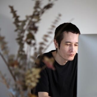
Thomas Girard (born 30 December, 1980 in Vancouver) is a Canadian scholar. Girard was accepted to attend the University of Oxford in lectures equivalent to graduate coursework. Girard has received several Emerging Scholar awards, first at the Design Principles and Practices conference in Barcelona at the prestigious ELISAVA. At Emily Carr University of Art and Design he received his second Emerging Scholar award. Other awards include RBC Emerging Scholar, Royal Bank of Canada Foundation. In 2021, he was awarded Emerging Scholar from the New Directions in the Humanities conference in Madrid. He is a 2022 graduate of the Graduate Liberal Studies programme at Simon Fraser University. He presented “Advanced Typography Workshops in Quarantine” at the Sorbonne in June 2023. [Editor’s note: Thomas Girard has written several essays for The BC Review, including a series on the subject of typography, User experience & Sophocles, Teaching typography in quarantine and Podiums, prototypes, and Plato. He has also reviewed books by Garnet Hertz and Ron Wakkary for The British Columbia Review.]
*
The British Columbia Review
Interim Editors, 2023-25: Trevor Marc Hughes (non-fiction), Brett Josef Grubisic (fiction and poetry)
Publisher: Richard Mackie
Formerly The Ormsby Review, The British Columbia Review is an online book review and journal service for BC writers and readers. The Advisory Board now consists of Jean Barman, Wade Davis, Robin Fisher, Barry Gough, Hugh Johnston, Kathy Mezei, Patricia Roy, Maria Tippett, and Graeme Wynn. Provincial Government Patron (since September 2018): Creative BC. Honorary Patron: Yosef Wosk. Scholarly Patron: SFU Graduate Liberal Studies. The British Columbia Review was founded in 2016 by Richard Mackie and Alan Twigg.
“Only connect.” – E.M. Forster